Taste that survives a dense table.
A palette that looks good on a hero and fails on a form is not a system. The UI Lab resolves a direction into canvas, ink, signal and support, tells you which text colours are actually readable on each, and hands the result over as CSS variables, a Tailwind theme or design tokens.
Product, UI and UX designers
← All professions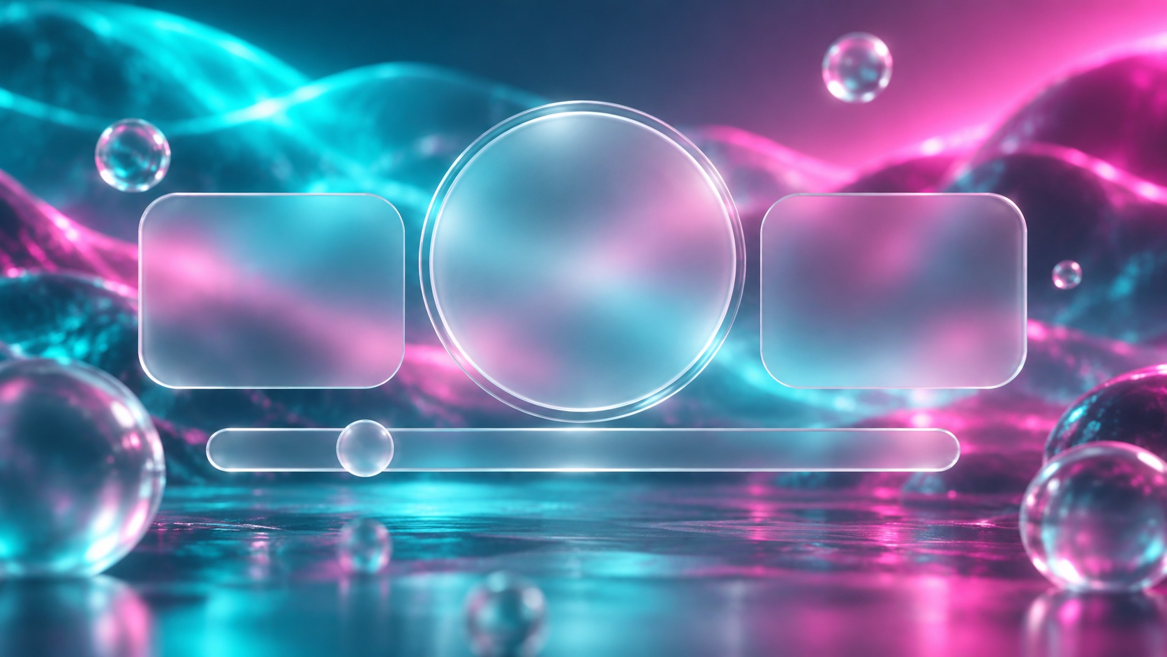
Resolve a direction into roles, check readability, export the tokens, then stress it against a table and a form in an error state.
02Faces that hold up at 12px, with the weights that ship.
03Where the interface colours come from before the roles are assigned.
Turn a dial and the library re-ranks itself. Leave one in the middle to ignore it.
Frosted glass surfaces with backdrop blur and floating transparency.
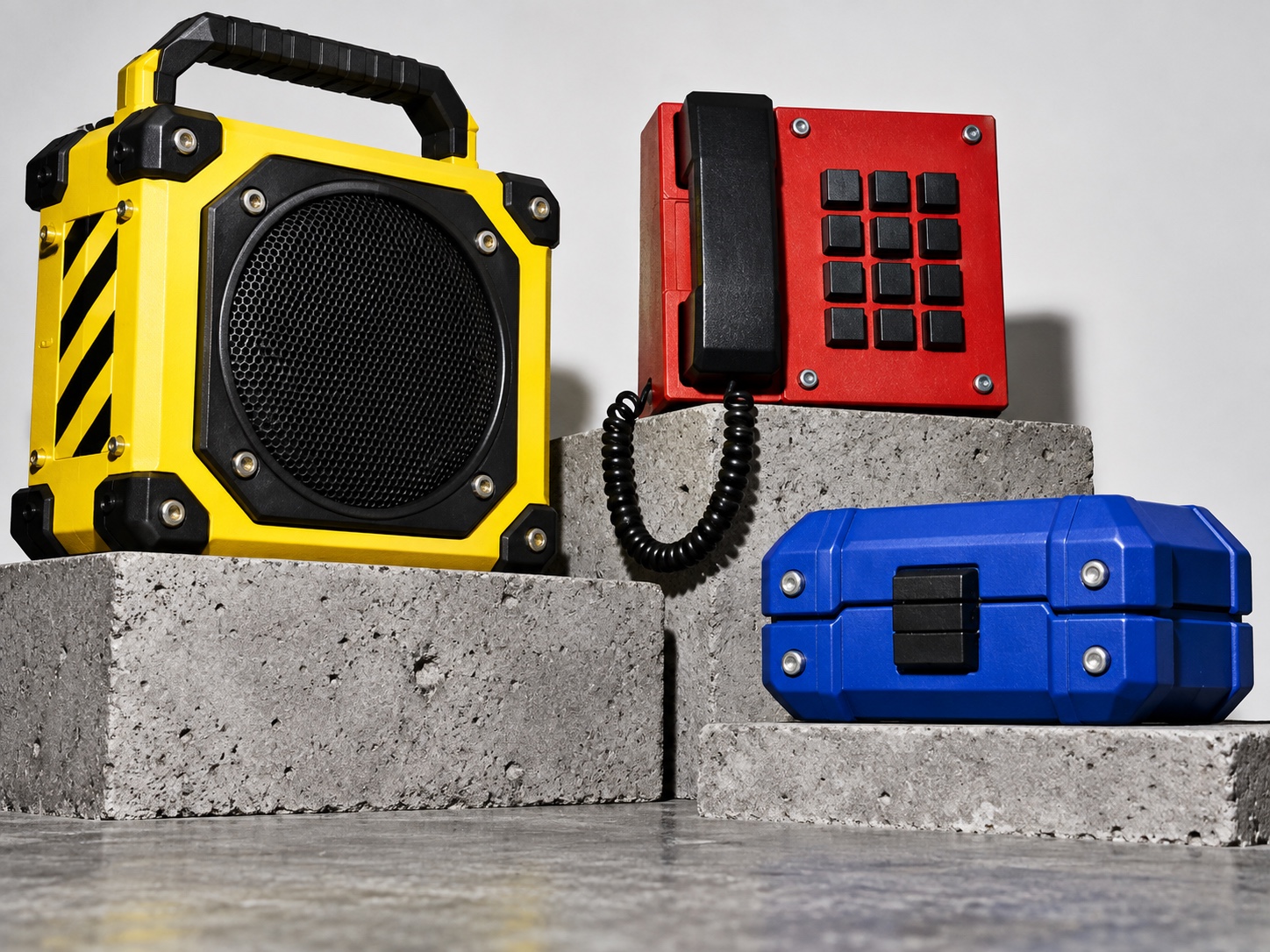
Raw, bold interfaces with heavy borders, stark shadows, and unapologetic contrast.
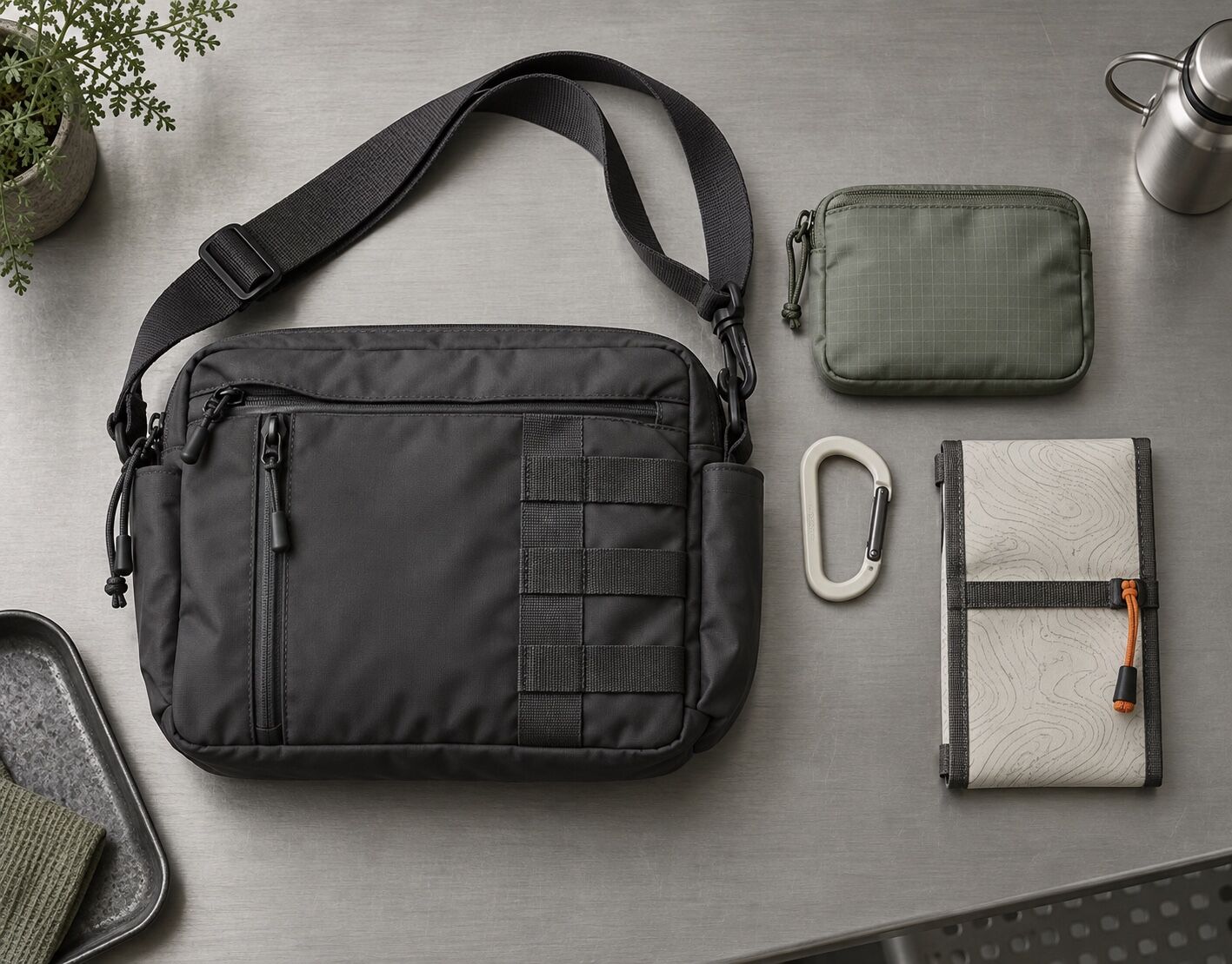
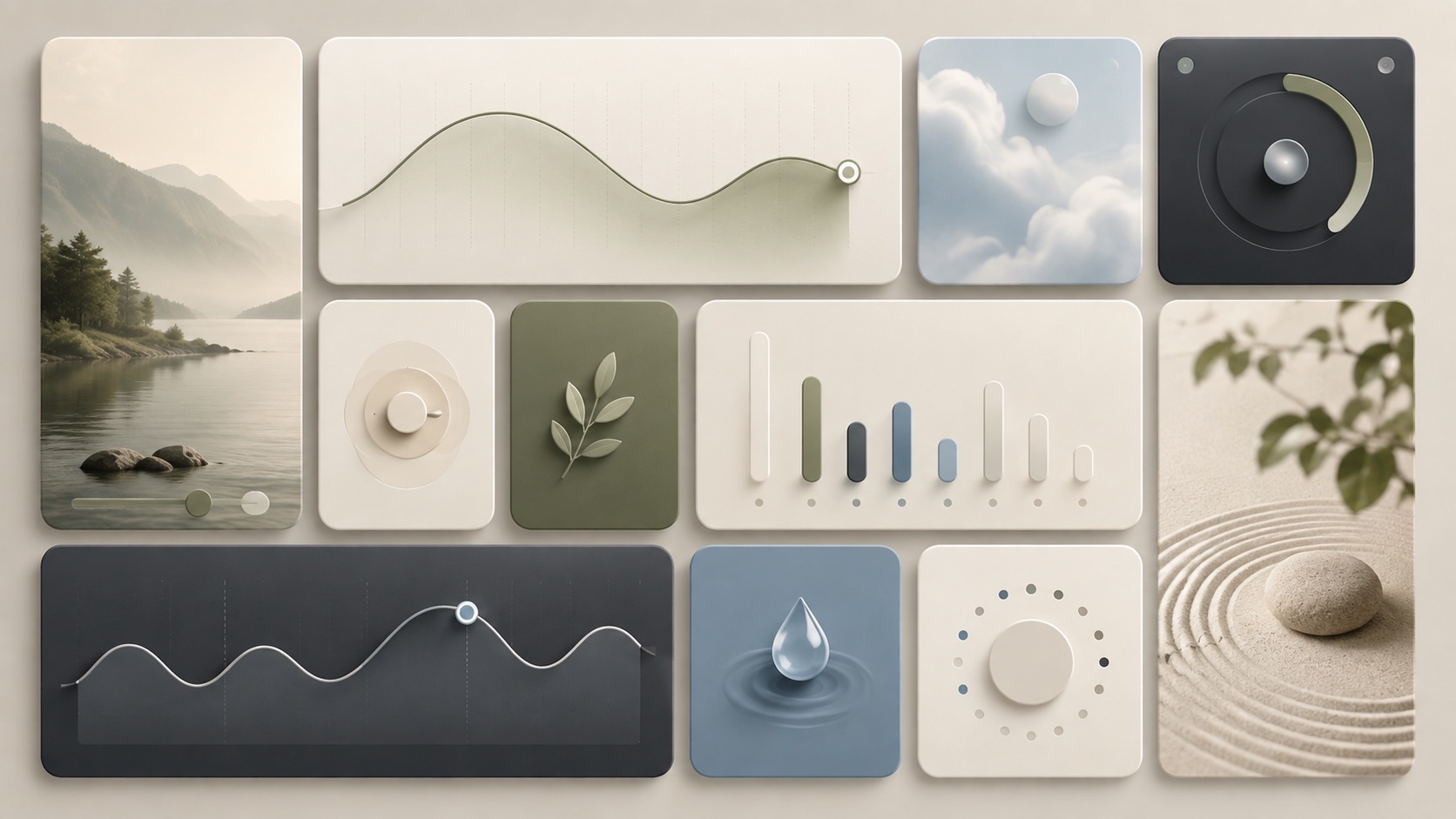
Functional design that feels warm instead of cold. Rounded inputs, muted earth tones, paper textures, hand-drawn icons and quiet type. Utility software dressed in linen, not steel.
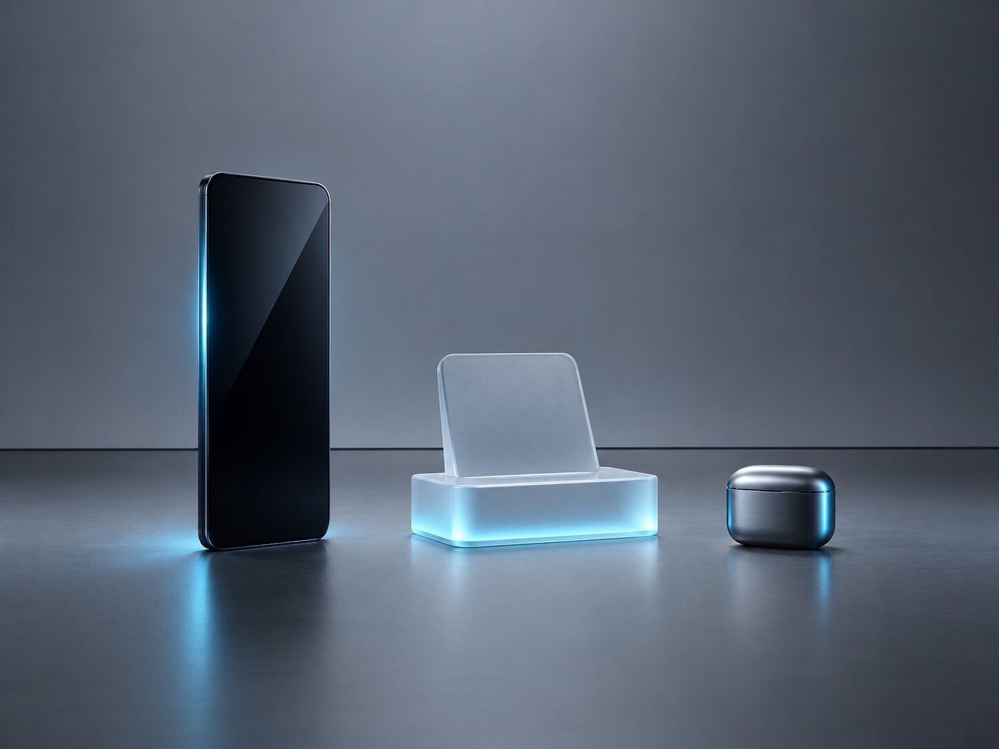
Stripped-down tech aesthetic with monospace type and terminal interfaces.
Grid-locked modular layouts where each card is a self-contained unit. Dense information architecture made legible through strict alignment, rounded corners and generous internal padding.
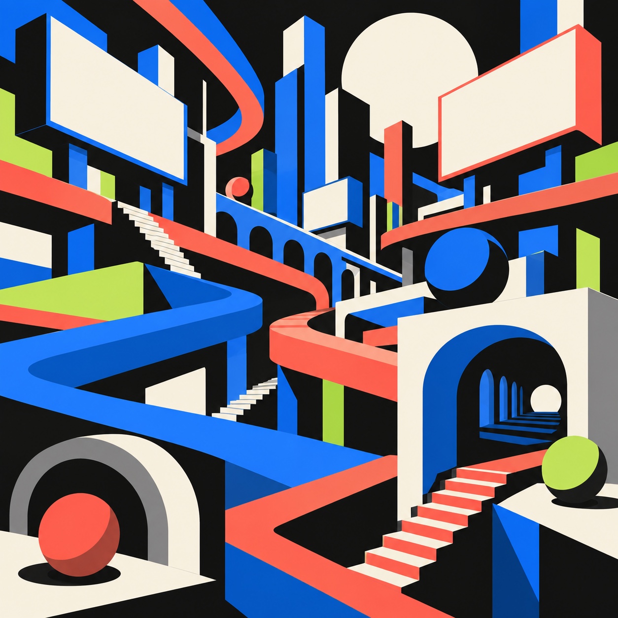
Dimensional scenes built from flat-shaded geometric volumes: arches, stairs, spheres, plinths and oversized plants and fruit in saturated colour, each surface given two or three flat tones instead of a render, with fine grain on top. Somewhere between a vector poster and an architectural model, playful but precisely constructed.